Graphic · Corporate Identity
A strong, consistent corporate identity — from logo to packaging — for AS Fren, a heavy-vehicle spare parts company.
- Role
- Logo & corporate identity
- Year
- 2023
- Client
- AS Fren
- Industry
- Heavy-vehicle spare parts
Related servicesGraphic Design
What I did
- Logo design
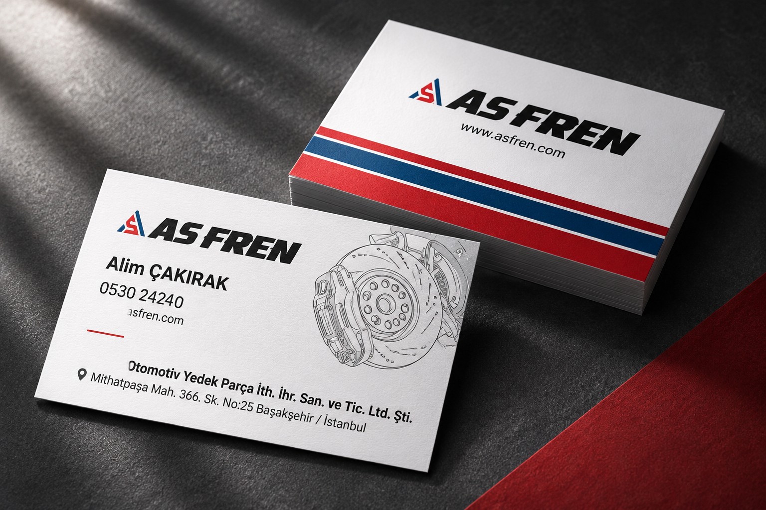
- Corporate identity and business cards
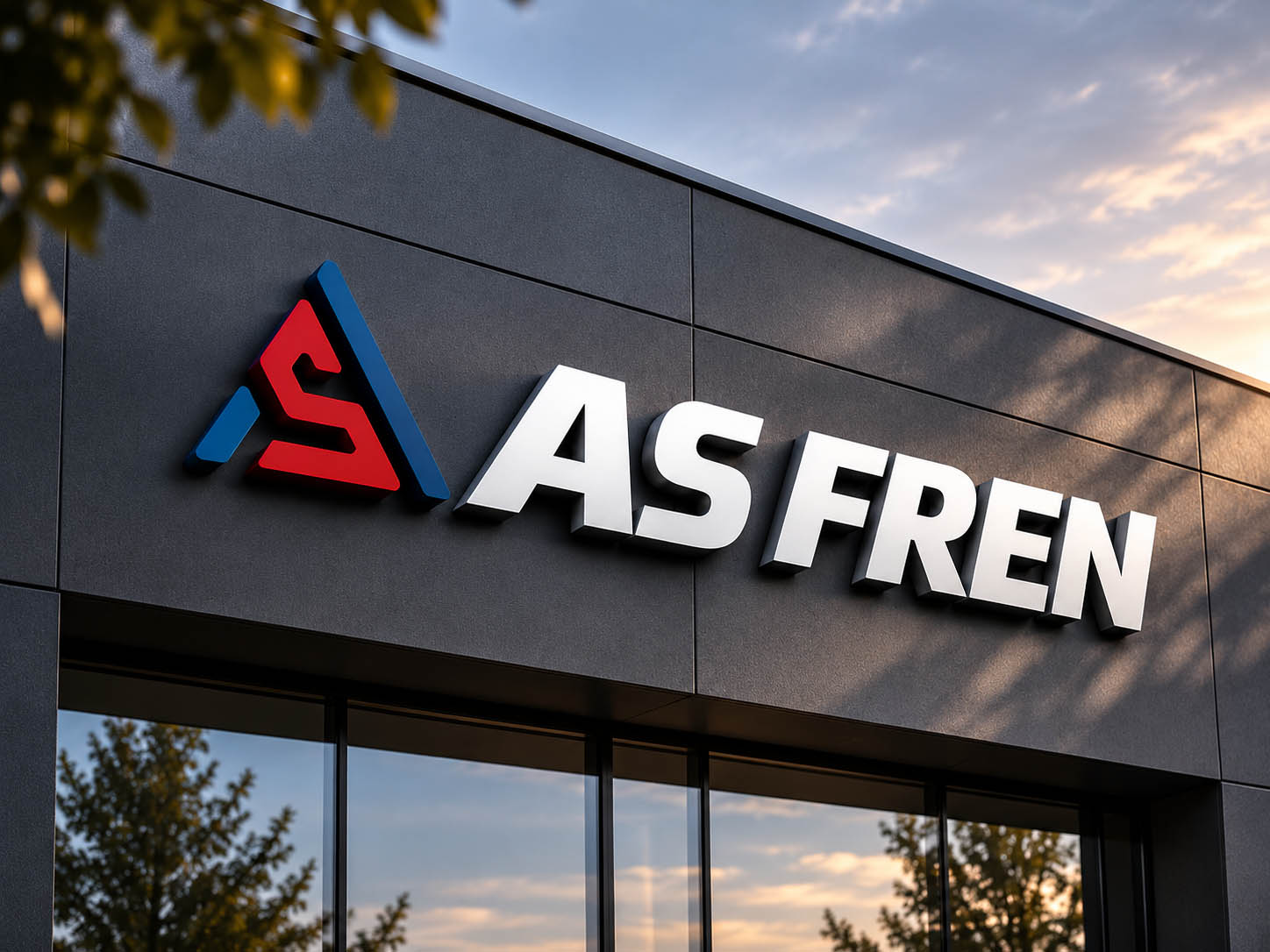
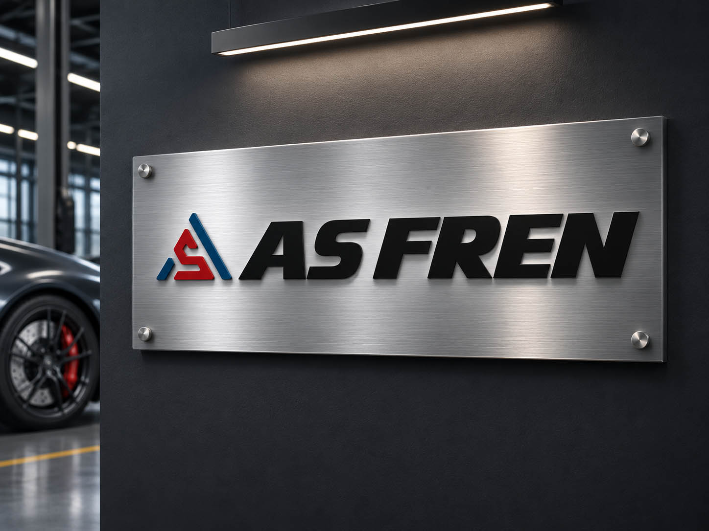
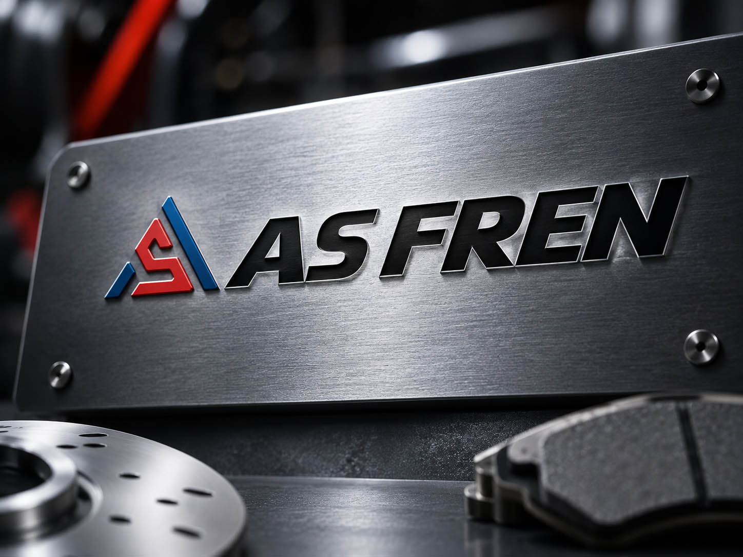
- Signage applications
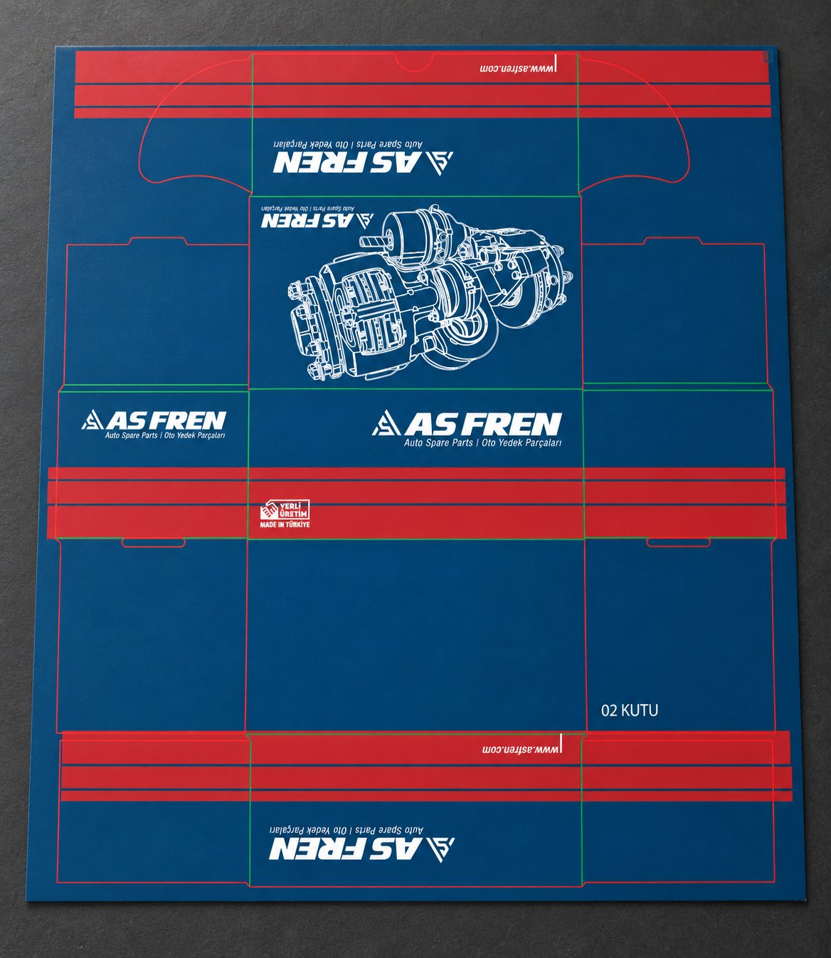
- Product box (packaging) design
- Product catalogue
About the project
AS Fren sells brake systems and spare parts for heavy vehicles. In a tough, technical industry, the goal was a brand language that builds trust, reads from a distance and is recognised the same way in every application.
I brought all visual communication — logo, business cards, signage, product boxes and catalogue — together under a single identity.
Applications
01 — Logo
A symbol with a sense of speed and strength
In the symbol, the letters A and S merge into a triangular form; red and navy tones carry the brand’s energy and reliability.
The bold, slanted typeface reinforces a feeling of motion and durability, and stays legible both on signage and at small sizes.
02 — Corporate identity
One language at every touchpoint
From business cards to signage, every application uses the same colours, the same typography and a consistent use of the symbol.
The brake-system line drawing on the business card visually supports the brand’s technical expertise.
03 — Packaging
A product box recognised on the shelf
The product box combines a navy background, red stripes and a white technical drawing; it is designed to show the brand from every side.
With a “Made in Türkiye” mark and a bilingual product description (Auto Spare Parts | Oto Yedek Parçaları), the packaging is ready for both domestic and export markets.
04 — Result
From symbol to packaging: a brand that builds trust in the heavy-vehicle spare parts world and is recognised the same way everywhere.