Graphic · Corporate Identity
Logo, corporate identity and brochure design for Atak Logistics & Transport, bringing together a sense of motion and trust.
- Role
- Logo & corporate identity
- Year
- 2022
- Client
- Atak Taşımacılık
- Industry
- Logistics & transport
Related servicesGraphic Design
What I did
- Logo design
- Corporate identity and business cards
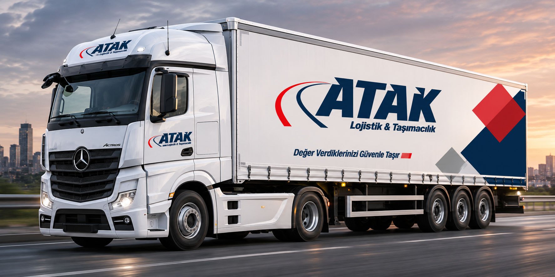
- Truck livery
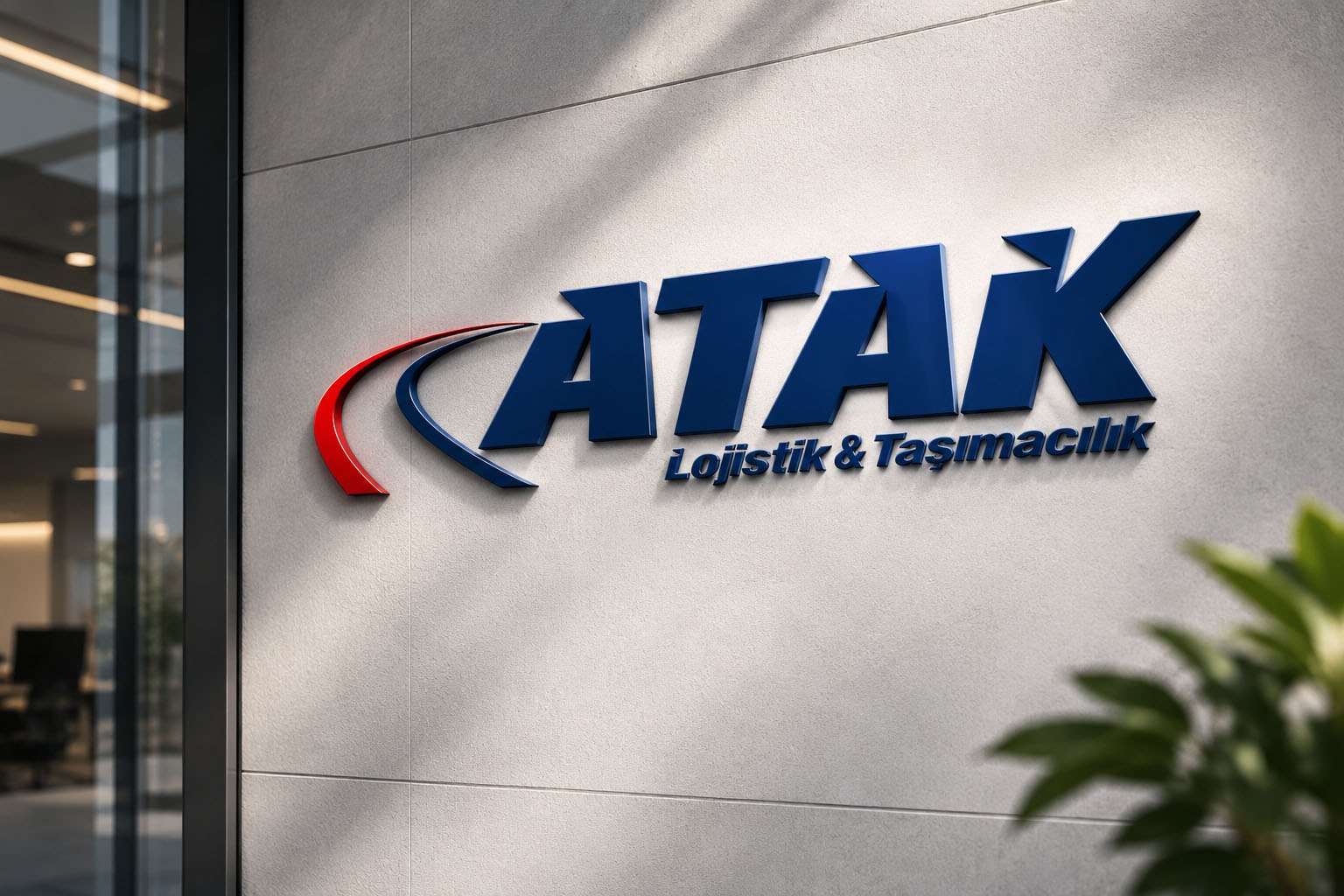
- Signage
- Delivery points brochure
About the project
Atak is a logistics and transport company running regular shipments to many destinations, mainly across the Aegean and Marmara regions. The goal was a brand that inspires the same trust on the road, in the warehouse and at the desk — and is recognised from a distance.
I brought all visual communication — logo, business cards, truck livery and the customer brochure — together in a single language.
Applications
01 — Logo
A brand on the move
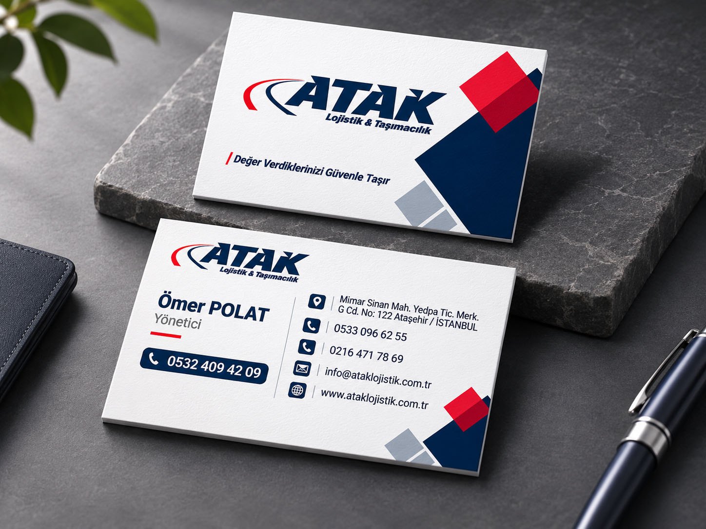
Bold, slanted letters convey speed and determination; the red and navy swooshes in front of the letters suggest the road and motion.
The tagline “Değer Verdiklerinizi Güvenle Taşır” (Carrying what you value, safely) repeats the brand’s promise in every application.
02 — Corporate identity
One language from business card to trailer
A graphic language of navy, red and grey squares is used the same way on business cards, signage and the truck trailer.
As a result, the brand is recognised at first glance both in the office and on the road.
03 — Brochure
Aegean delivery points
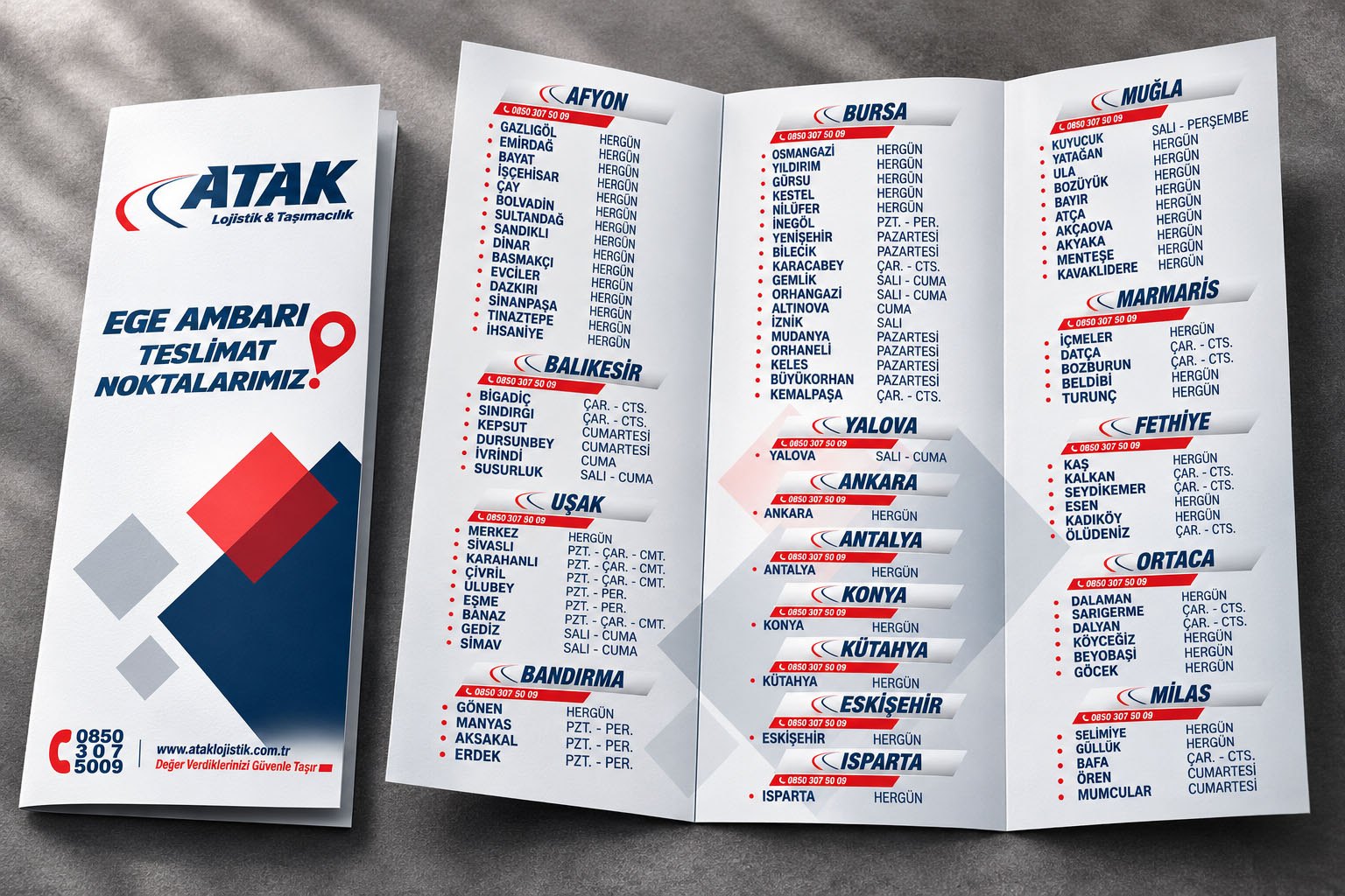
The tri-fold brochure presents cities and districts together with their delivery days as an easy-to-scan list.
A repeated phone number under every city heading and the swoosh from the logo keep even information-dense content tidy and on-brand.
04 — Result
Speed, trust and consistency: a logistics brand recognised the same way on the road, in the office and in the customer’s hands.