Graphic · Personal Brand
From an idea to a visual identity. A personal brand identity where creativity, technology and strategic thinking meet in a single visual language.
- Role
- Logo & visual identity
- Year
- 2026
- Brand
- Furkan Tosun
- Scope
- Concept development
Related servicesGraphic Design
What I did
- Concept and idea development
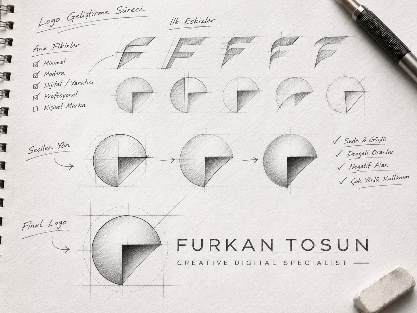
- Logo sketches and form alternatives
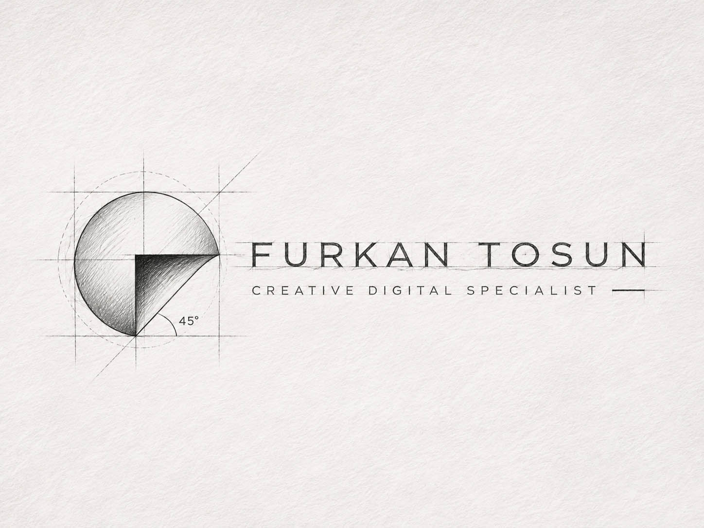
- Geometry, proportions and grid system
- Colour palette and typography
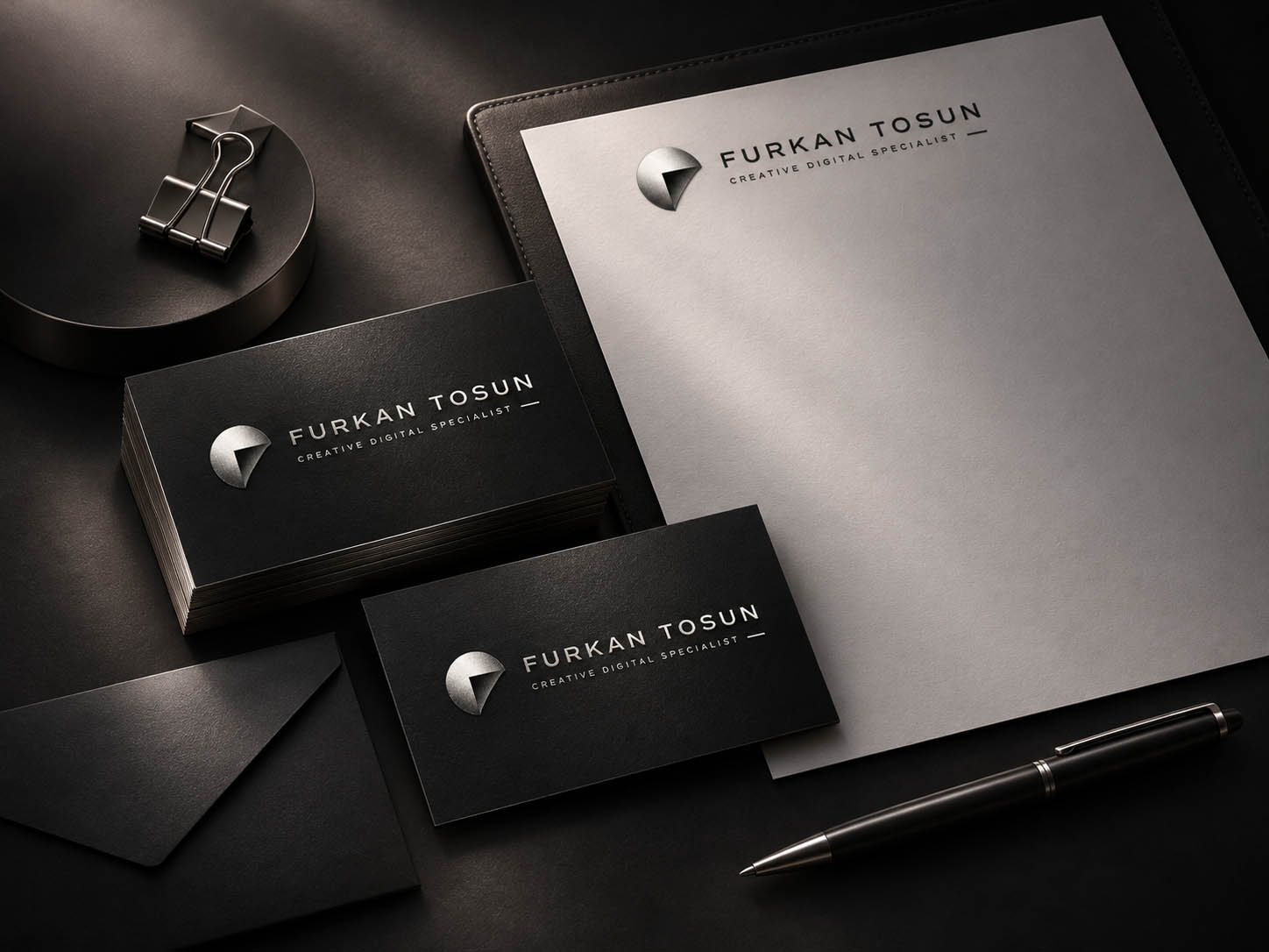
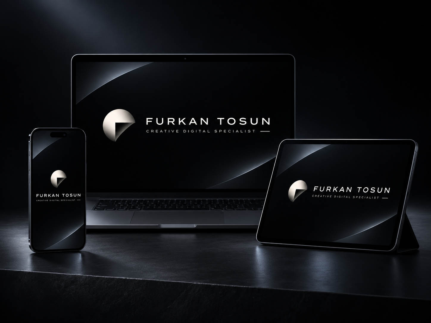
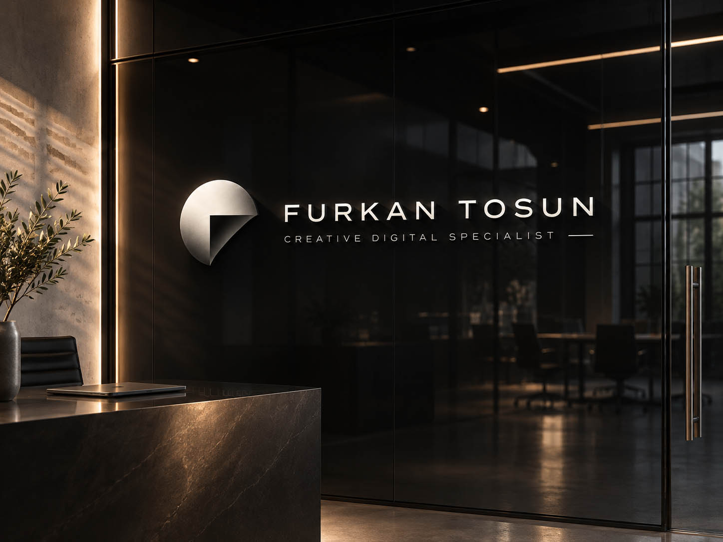
- Stationery, signage and digital applications
About the project
The Furkan Tosun personal brand identity was built on the idea of bringing creativity, technology and strategic thinking together in one visual language.
The starting point was a simple, timeless symbol able to represent different disciplines: graphic design, photography, video production, digital marketing and technology.
Applications
01 — Process
Concept & design process
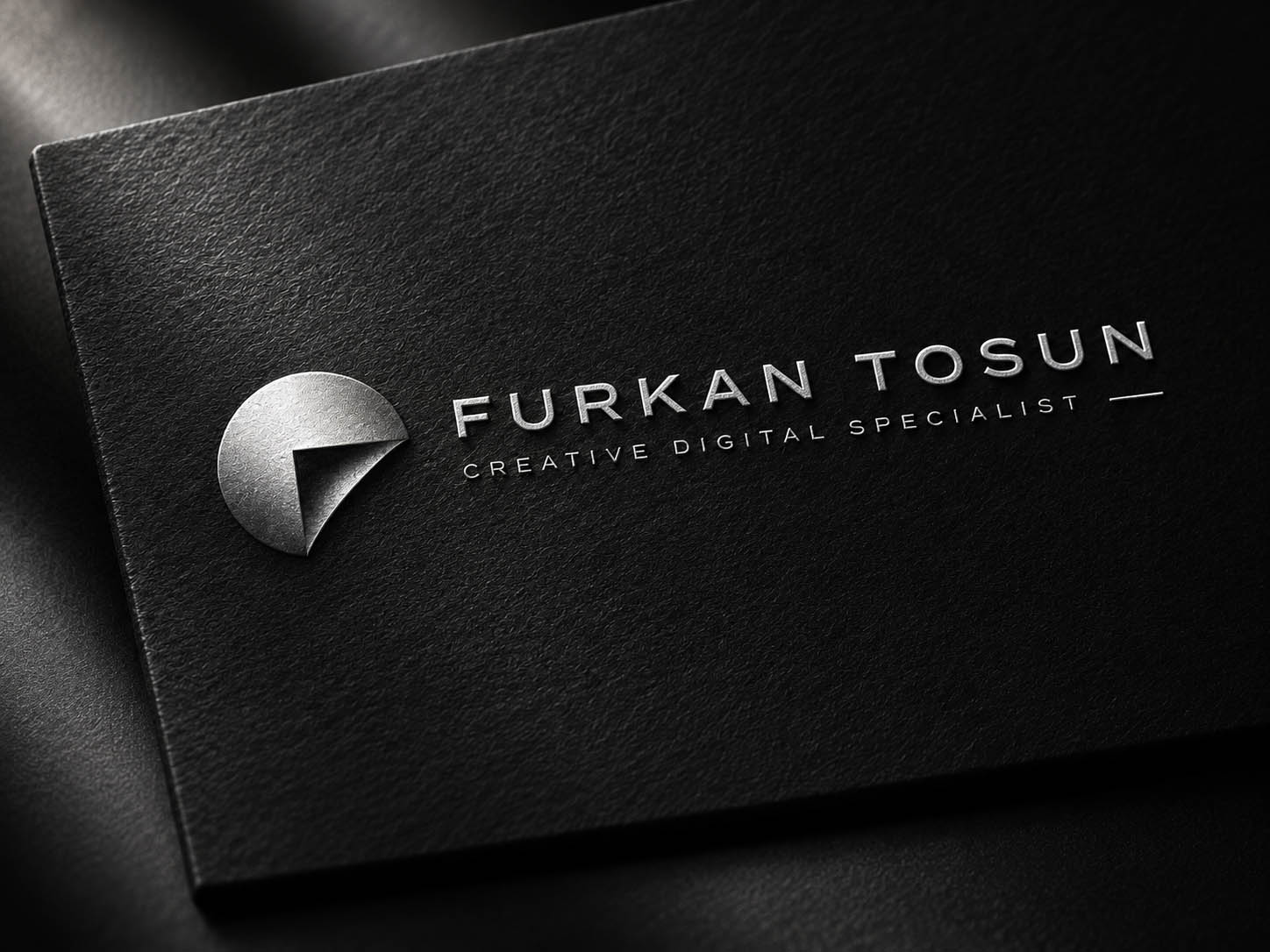
The concept highlights wholeness, perspective and transformation. The circular form stands for holistic thinking and the meeting of disciplines, while the geometric cut within it symbolises new perspectives and creative transformation.
The first sketches explored different geometric approaches, proportions and form alternatives around the letter F and the circle. The chosen direction was shaped by simplicity, visual balance and versatility across media.

02 — Identity
Visual identity
A palette of black, anthracite and silver was chosen for a modern, strong and sophisticated character.
Minimal typography and a geometric symbol create a consistent, flexible visual language, from the portfolio and print materials to social media and motion graphics.
03 — The essence
This identity is more than a name or a symbol; it is a visual expression of creative thinking fed by many disciplines.
I design. I produce. I develop.