Graphic · Logo Design
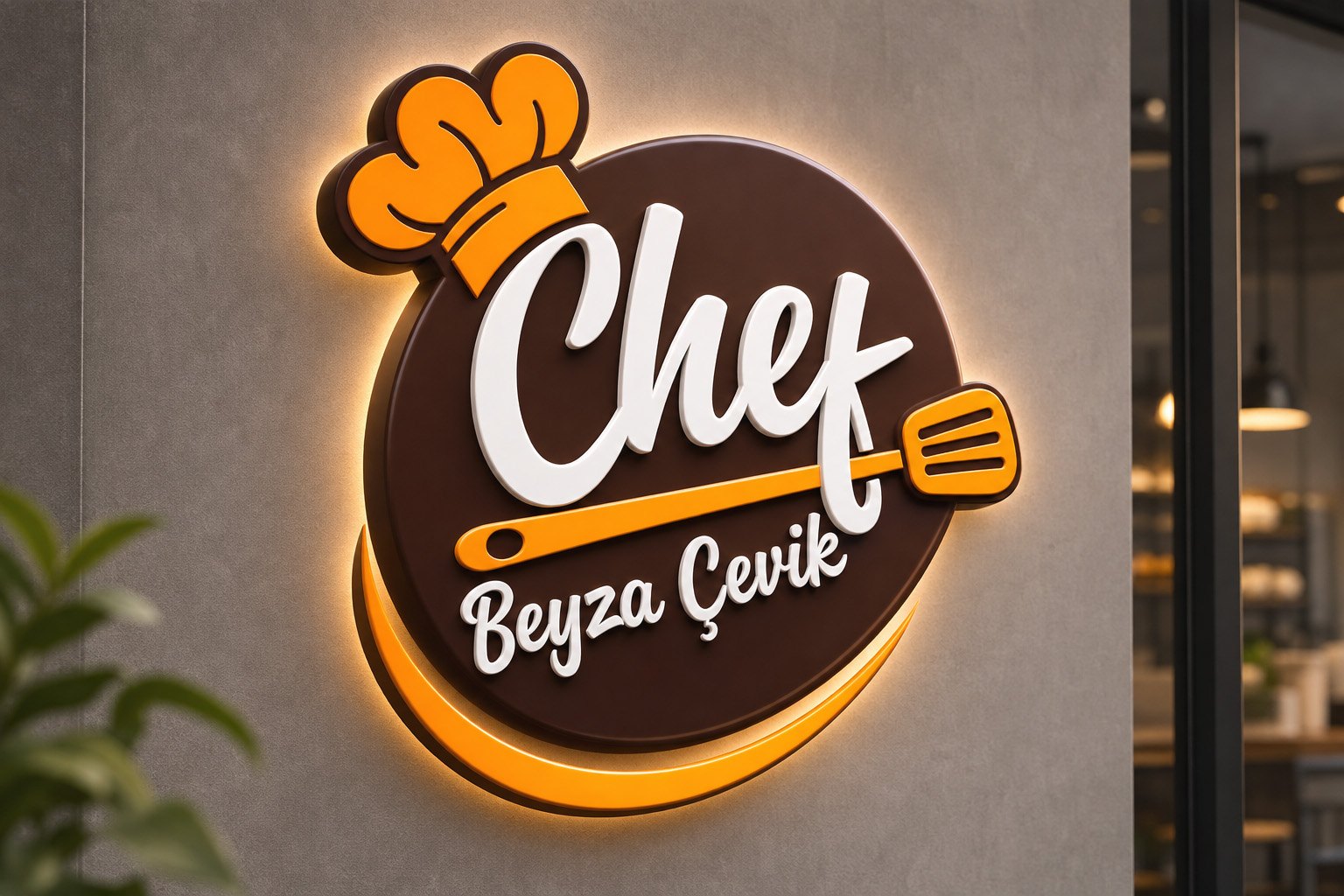
A warm, friendly and appetising personal brand logo for Chef Beyza Çevik — usable everywhere from the kitchen to takeaway packaging.
- Role
- Logo design
- Year
- 2020
- Brand
- Chef Beyza Çevik
- Industry
- Food & pastry
Related servicesGraphic Design
What I did
- Logo design
- Single-colour (kraft) logo version
- Colour palette
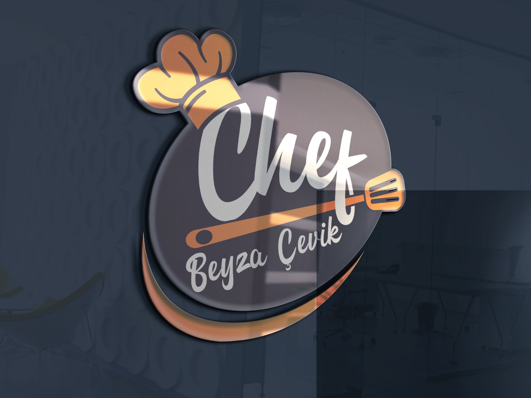
- Signage and glass applications
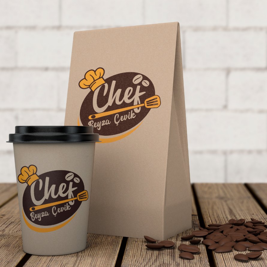
- Cup and packaging mockups
About the project
The goal was a logo that reflects Beyza Çevik’s energy and warmth in the kitchen and says “chef” at first glance.
The logo was designed to keep the same character across signage, glass surfaces, coffee cups and packaging.
Applications
01 — Logo
Chef’s hat and spatula
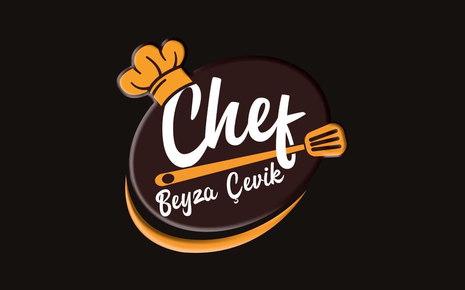
The handwritten word “Chef”, a chef’s hat and a spatula cutting across the mark bring the movement of the kitchen together in a single sign.
A brown base with orange accents evokes the warmth of chocolate, coffee and freshly baked treats.
02 — Colour & versions
Single colour on kraft
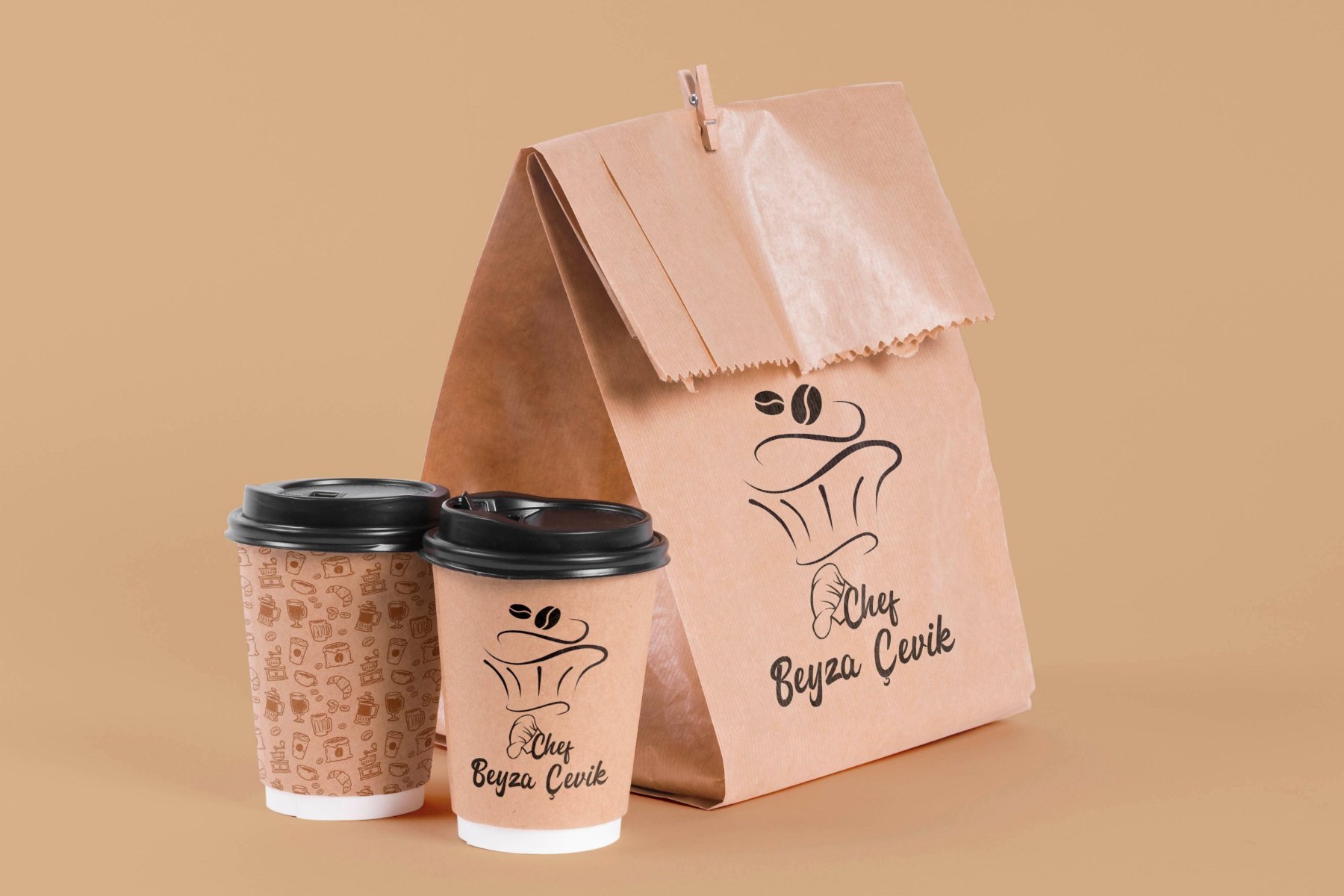
A linear, single-colour version of the logo was prepared for print surfaces such as kraft cups and paper bags.
This keeps the brand recognisable even on cost-effective packaging where full-colour printing isn’t possible.
03 — Result
Warm, friendly and appetising: a chef brand that carries the same character from the kitchen to takeaway.